8 EJ - Praxis and Visualization
Today we will focus on a bit of theory, a story about warehouses, and then engage in the practice of data driven visualization.
The EPA and California EPA both agree that this is the definition of Environmental Justice (EJ).
The fair treatment and meaningful involvement of all people regardless of race, color, culture, national origin, income, and educational levels with respect to the development, implementation, and enforcement of protective environmental laws, regulations, and policies. Fair treatment means that no population, due to policy or economic disempowerment, is forced to bear a disproportionate burden of the negative human health or environmental impacts of pollution or other environmental consequences resulting from industrial, municipal, and commercial operations or the execution of federal, state, local, and tribal programs and policies
8.1 Data Categories in EJ Tools
As discussed, in the previous lesson, there are a few broad categories of data that are currently used in Environmental Justice (EJ) tools. Let’s recap them here.
- Pollution Burden - negative environmental indicators of either pollution exposure, built environment, or environmental effects (e.g., ozone, PM, traffic, drinking water contaminants, toxic release facilities)
- Socioeconomic indicators - demographic and economic indicators of population
- Health vulnerability - an indicator of population level health-effect data such as asthma, cancer, diabetes, cardiovascular, and low birth-weight
As we noted in the last class, these visualizations are more about identifying or screening for locations experiencing environmental injustice than about achieving or visualizing Environmental Justice.
8.1.1 Discussion 1
- What data is needed to understand the fair treatment principle of Environmental Justice?
- What data is needed to understand the meaningful involvement principle of Environmental Justice?
- How does data availability limit our understanding and ability to visualize Environmental Justice?
8.2 Not Data - Not Available
Meaningful involvement is a very nebulous and hard-to-measure concept. Within the context of EJ, it indicates public participation with stakeholders and the influence to shape decision-making.
The EPA has a resource on public participation in decision-making.
Public participation is a process, not a single event. It consists of a series of activities and actions by a sponsor agency over the full lifespan of a project to both inform the public and obtain input from them. Public participation affords stakeholders (those that have an interest or stake in an issue, such as individuals, interest groups, communities) the opportunity to influence decisions that affect their lives.
A large part of that framework is based on a schematic as shown in Figure 8.1 of the different possible levels of involvement by stakeholders in decision-making. The schematic is from the International Association of Public Participation.
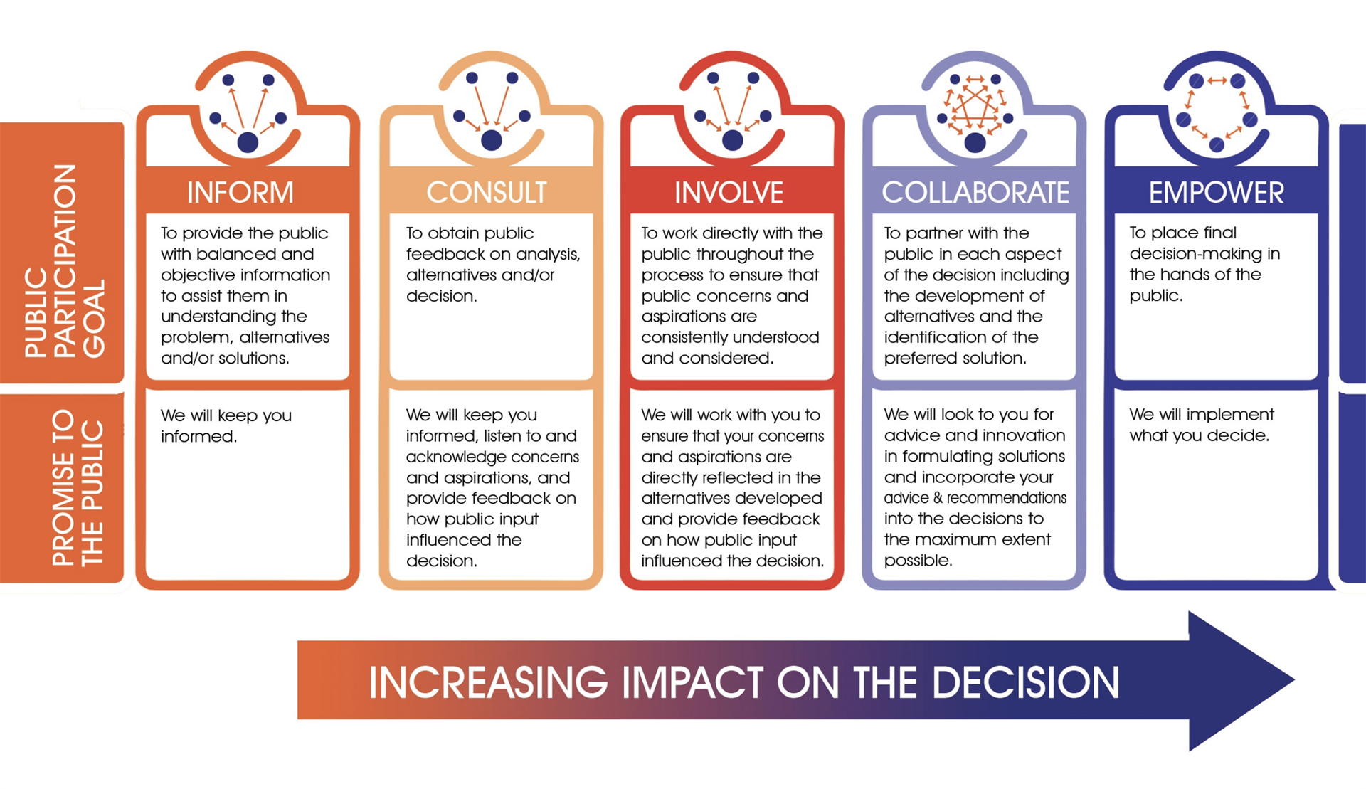
Quantifying meaningful involvement in a public participation process of decision-making is complicated and difficult to track. It is also a subjective judgement, although one could have systematic criteria for evaluating it. Moreover, the issue is probably better described as one in which the involvement levels are unequal between different stakeholder groups. In other words, developers and industry stakeholders are provided greater opportunity to shape policy and decision-making compared to residential and environmental stakeholders.
8.2.1 Discussion 2.
- How does a lack of data shape our ability to communicate and visualize an issue?
- How could one collect information to visualize meaningful involvement?
8.3 Case Study - SoCal Warehouses - March JPA West Campus Upper Plateau
I have been doing work with the Redford Conservancy on warehouses in the Inland Empire. As part of that work, I have developed a few mapping tools to visualize warehouse information.
The primary tool is called WarehouseCITY. WarehouseCITY is intended to provide a means for the public to easily access the impact of existing warehouses on their community. The code repository is located on github.
A secondary tool provides a visualization of the existing and planned warehouse growth along the 215/60 freeways around the March Air Reserve Base in Riverside County (my backyard). That project’s draft Environmental Impact Report (EIR) is here
8.3.2 Warehouse Visualization is Easy
8.3.2.1 Load libraries
8.3.2.2 Acquire data
We will also pull warehouse data for the first time! New data incoming!
Also note that I made this dataset smaller by using the filter() function to only include data from Riverside County; this removes about 7,500 warehouses from LA and San Bernardino counties.
WH.url <- 'https://raw.githubusercontent.com/RadicalResearchLLC/WarehouseMap/main/WarehouseCITY/geoJSON/comboFinal.geojson'
warehouses <- st_read(WH.url) |>
  filter(county == 'Riverside County') |>
  st_transform("+proj=longlat +ellps=WGS84 +datum=WGS84")
Reading layer `comboFinal' from data source
`https://raw.githubusercontent.com/RadicalResearchLLC/WarehouseMap/main/WarehouseCITY/geoJSON/comboFinal.geojson'
using driver `GeoJSON'
Simple feature collection with 9106 features and 8 fields
Geometry type: MULTIPOLYGON
Dimension: XY
Bounding box: xmin: -118.8037 ymin: 33.43325 xmax: -114.4085 ymax: 35.55527
Geodetic CRS: WGS 84Check to see what the warehouses dataset looks like.
head(warehouses)Simple feature collection with 6 features and 8 fields
Geometry type: MULTIPOLYGON
Dimension: XY
Bounding box: xmin: -117.6083 ymin: 33.87729 xmax: -117.5314 ymax: 33.97265
Geodetic CRS: +proj=longlat +ellps=WGS84 +datum=WGS84
apn shape_area category year_built class
1 115050036 343300 Existing 2000 warehouse/dry storage
2 115060057 212500 Existing 1980 warehouse/dry storage
3 115670012 73600 Existing 1999 warehouse/dry storage
4 144010065 90600 Existing 1980 warehouse/dry storage
5 144010079 213300 Existing 2019 warehouse/dry storage
6 144010064 93200 Existing 2018 warehouse/dry storage
county unknown place_name geometry
1 Riverside County FALSE Corona MULTIPOLYGON (((-117.543 33...
2 Riverside County TRUE Corona MULTIPOLYGON (((-117.5532 3...
3 Riverside County FALSE Corona MULTIPOLYGON (((-117.5314 3...
4 Riverside County TRUE Eastvale MULTIPOLYGON (((-117.5954 3...
5 Riverside County FALSE Eastvale MULTIPOLYGON (((-117.6073 3...
6 Riverside County FALSE Eastvale MULTIPOLYGON (((-117.5946 3...8.3.2.3 Basic Visualization
This is geospatial data, so we should put it in an interactive leaflet map to do an initial visualization. Figure 8.2 shows a very basic polygon leaflet map.
leaflet() |>
  addTiles() |>
addPolygons(data = warehouses)8.3.2.4 Improve the Visualization
The setView() function allows us to set the zoom level and the centerpoint of the map using the arguments lng, lat, and zoom.
Within the addPolygons() function, I set the color to brown and the weight of the line to 1.
Figure 8.3 shows the result for my neighborhood in Riverside.
leaflet() |>
  addTiles() |>
  addPolygons(data = warehouses,
              color = 'black',
              weight = 1) |>
setView(lng = -117.24, lat = 33.875, zoom = 12) Let’s add two more helpful things to orient viewers at a glance.
- Let’s change the underlying tile to satellite/aerial imagery using
addProviderTiles() - Let’s add a mini-map to orient the viewer to where this is using
addMiniMap().
Figure 8.4 shows the resulting map - note I added a palette to distinguish between existing warehouses (orange) and planned and approved warehouses (red) because brown has low salience in satellite imagery of SoCal.
palWHtype <- colorFactor(palette = c( 'darkred', 'darkorange', 'black'),
                         domain = warehouses$category)

leaflet()  |>
  addProviderTiles(provider = providers$Esri.WorldImagery) |> # This shows satellite imagery
  addPolygons(data = warehouses,
              color = ~palWHtype(category), #this creates the color categories
              weight = 1) |>
  setView(lng = -117.24, lat = 33.875, zoom = 12) |> #this provides the location and zoom level
  addMiniMap(position = 'bottomleft') #this adds a minimap