Unit 1: Introduction to Data Visualization
The most common environmental dataset that people encounter is the weather. Every major type of media devotes time to the weather: newspapers, news shows, apps, twitter bots, and The Weather Channel.
It is a great example for us to start talking about environmental data. Additionally, the weather is often confused for the Climate. Given the existential threat of Climate Change, we’ll explore, replicate, and maybe improve some climate visualizations.
Comparative Analysis
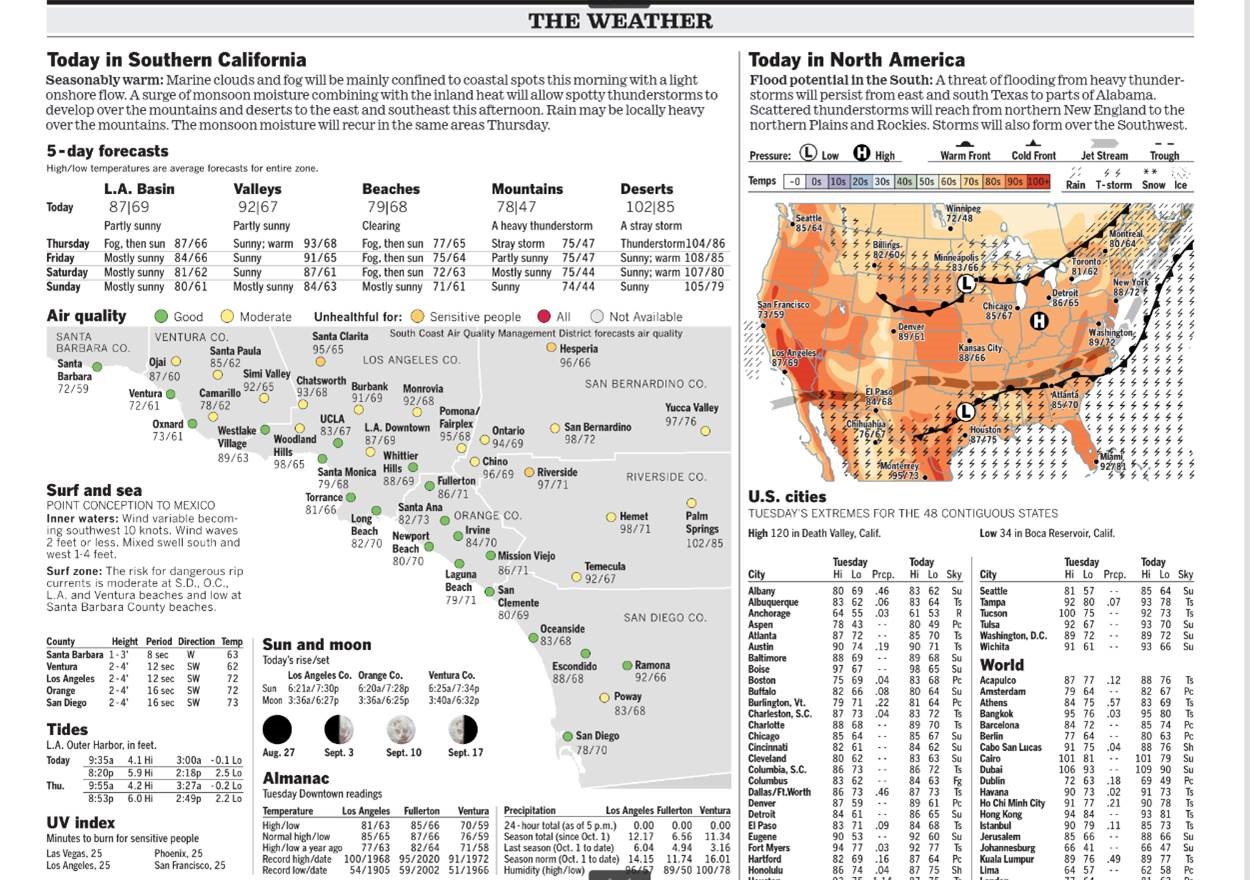
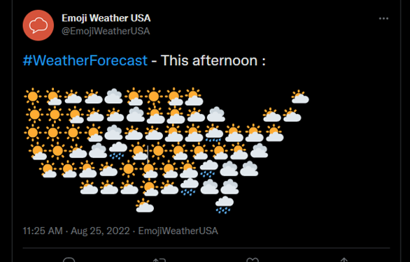
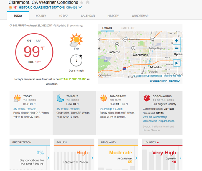
Examine Figure 1 from the Los Angeles Times, a Twitter emoji weather map, and a screenshot from Wunderground.
What are your impressions of these different visualizations?