14 Data Science 101
Today we focus on the practice of manipulating data in R
14.1 Introduction
‘Tidy datasets are all alike, but every messy dataset is messy in its own way.’
— Hadley Wickham

Mr. Wickham is of course quoting Tolstoy, but his observation is poignant and correct. Much of the work in data visualization is finagling one’s dataset.
Today, we will focus on some key functions to tidy messy data, as compiled by me. Examples will be provided using data from previous lectures.
Let’s get started with initializing today’s R script to include the libraries we’ll be using. Start with tidyverse and sf.
14.1.1 st_transform()
st_transform() transforms or converts coordinates of simple feature geospatial data. Spatial projections are fraught with peril in geospatial visualizations. Our first function is one that has been used a bunch of times - st_transform(). Leaflet needs its data transformed into WGS84 and st_transform() is the function that makes the coordinate reference system go the right place.
URL.path <- 'https://raw.githubusercontent.com/RadicalResearchLLC/EDVcourse/main/CalEJ4/CalEJ.geoJSON'
SoCalEJ <- st_read(URL.path) |>
  st_transform("+proj=longlat +ellps=WGS84 +datum=WGS84")
Reading layer `CalEJ' from data source
`https://raw.githubusercontent.com/RadicalResearchLLC/EDVcourse/main/CalEJ4/CalEJ.geoJSON'
using driver `GeoJSON'
Simple feature collection with 3747 features and 66 fields
Geometry type: MULTIPOLYGON
Dimension: XY
Bounding box: xmin: 97418.38 ymin: -577885.1 xmax: 539719.6 ymax: -236300
Projected CRS: NAD83 / California Albers
14.1.2 filter()
filter() is used to subset a data table, retaining any rows that meet the conditions of the filter.
-
filter()is used on numbers by applying operators (e.g., >, =, <, >=, <=).
-
filter()can be applied on character strings by using the identity operator==.
-
filter()can be applied to multiple character strings by using the %in% operator on lists.
In the first example, filter()was applied to remove the values that were set at -999; we only believed values from 0-100 were reasonable. Figure 14.1 uses filter() to remove those values. I’ve also shown an example without the filter applied in Figure 14.2 . Not removing those rows messes up our visualization.
SoCalEJ |>
  filter(AsthmaP >= 0) |>
  ggplot(aes(x = County, y = AsthmaP)) +
  geom_boxplot()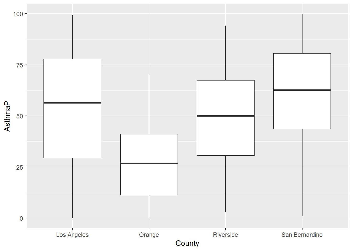
SoCalEJ |>
  #filter()
  ggplot(aes(x = County, y = AsthmaP)) +
  geom_boxplot()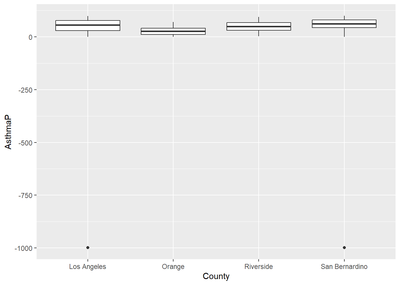
In Chapter 9 we also applied filter in two successive data transformations that are good examples of data munging. After creating a narrow data set, we apply filter(value >=0) to remove all negative values. Then we applied filter(variable %in% c('OzoneP', 'DieselPM_P', 'PolBurdP')) to select three specific variable choices out of the 55 we had available. If we exclude that second filter, the plot becomes crazy busy.
# select socioeconomic indicators and make them narrow - only include counties above 70%
SoCal_narrow <- SoCalEJ |>
  st_set_geometry(value = NULL) |>
  pivot_longer(cols = c(5:66), names_to = 'variable', values_to = 'value') |>
  filter(value >=0)

SoCal_narrow |>
  filter(variable %in% c('OzoneP', 'DieselPM_P', 'PolBurdP')) |>
  ggplot(aes(x = County, y = value, fill= variable)) +
  geom_boxplot()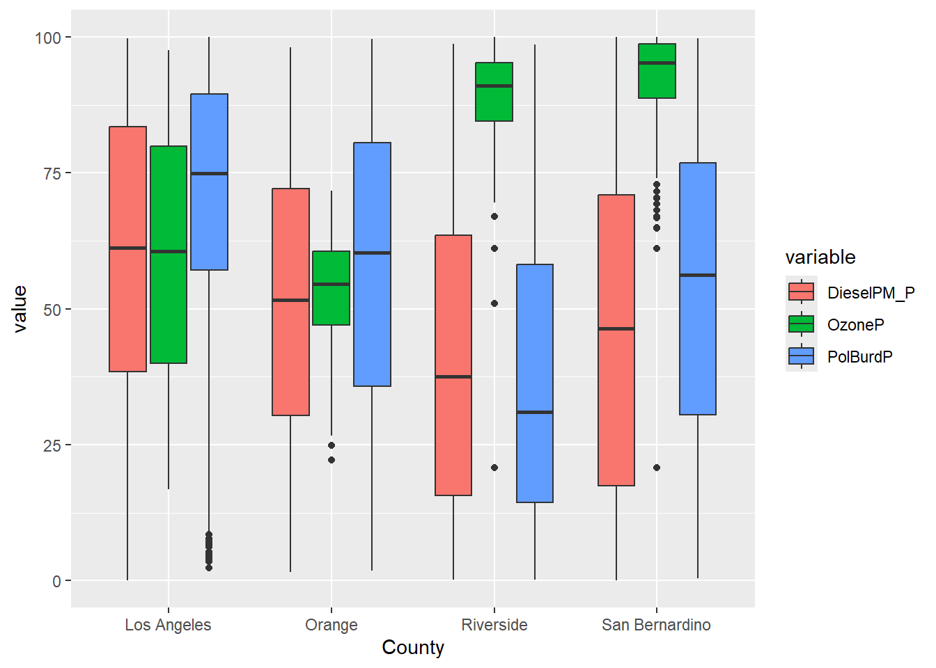
SoCal_narrow |>
  #filter(variable %in% c('OzoneP', 'DieselPM_P', 'PolBurdP')) |>
  ggplot(aes(x = County, y = value, fill= variable)) +
  geom_boxplot()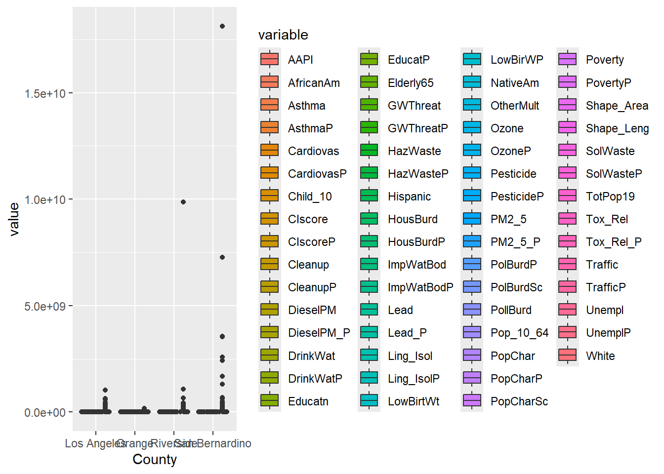
14.1.3 select()
select() variables (i.e., columns) in a data table for retention.
-
select()can be applied to subsets column number or name. -
select()also has some pattern matching helpers.
Chapter 7 included an example of using select() on the SoCalEJ dataset. The raw dataset is MESSY!
14.1.4 mutate()
mutate() adds new variables and preserves existing ones. mutate() can be used to overwrite existing variables - careful with name choices.
This is a great function for synthesizing information, transformations, and combining variables.
- changing units - use
mutate() - creating a rate or normalizing data - use
mutate() - need a new variable or category - use
mutate()
I used mutate() to create a decimal date function for our CH4 visualizations in Chapter 12.
Let’s use mutate() to convert the estimate the census tract population of Hispanic and African American groups in SoCalEJ. In SoCalEJ, we have a variable called TotPop19, which is the total population in 2019. We also have the percentage of population by census tract in each ethnic group. We can use mutate to create new variables.
SoCalEJ2 <- SoCalEJ |>
  #select only used variables
  select(Tract, TotPop19, Hispanic, AfricanAm) |>
  #filter to make sure we don't divide by zero population tracts
  filter(TotPop19 > 0 & Hispanic >= 0 & AfricanAm >= 0) |>
  #mutate to create new variables
  mutate(HispTot = round(Hispanic*TotPop19/100, 0),
         AfriAmTot = round(AfricanAm*TotPop19/100,0))

head(SoCalEJ2)
Simple feature collection with 6 features and 6 fields
Geometry type: MULTIPOLYGON
Dimension: XY
Bounding box: xmin: -117.874 ymin: 33.5556 xmax: -117.7157 ymax: 33.64253
Geodetic CRS: +proj=longlat +ellps=WGS84 +datum=WGS84
Tract TotPop19 Hispanic AfricanAm geometry HispTot
1 6059062640 3741 16.4662 4.9452 MULTIPOLYGON (((-117.7178 3... 616
2 6059062641 5376 22.0238 1.3765 MULTIPOLYGON (((-117.7166 3... 1184
3 6059062642 2834 5.6104 0.3881 MULTIPOLYGON (((-117.8596 3... 159
4 6059062643 7231 4.4530 0.0000 MULTIPOLYGON (((-117.7986 3... 322
5 6059062644 8487 8.8488 0.0000 MULTIPOLYGON (((-117.8521 3... 751
6 6059062645 6527 3.8302 0.2911 MULTIPOLYGON (((-117.8269 3... 250
AfriAmTot
1 185
2 74
3 11
4 0
5 0
6 19Now let’s make a figure of the Hispanic population in the Inland Empire.
ggplot() +
  geom_sf(data = SoCalEJ2, aes(fill = HispTot)) +
  theme_minimal() +
  scale_fill_viridis_c(direction = -1) +
  coord_sf(xlim =c(-118, -117),
           ylim = c(33.4, 34.2)) +
  labs(fill = 'Hispanic population')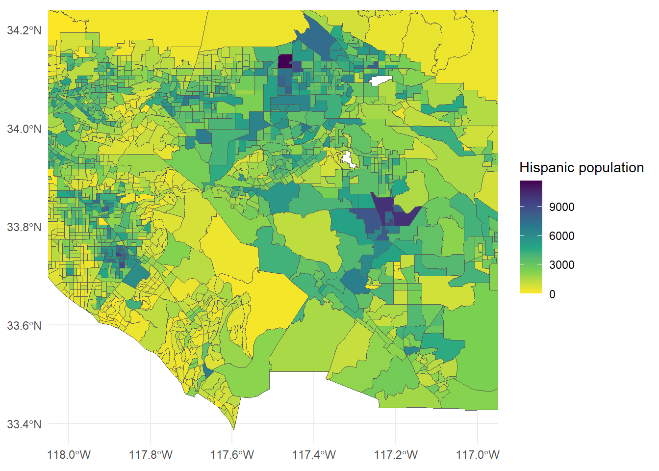
14.1.4.1 Exercise
- Make a figure of African American (or another ethnic/racial variable) population.
- Choose a different set of Southern California coordinates to focus in on.
- Choose another fill scheme (either another viridis or another scale_fill_brewer).
14.1.5 summarize()
summarize() creates a new table that reduces a dataset to a summary of all observations. When combined with the group_by() function, it allows extremely powerful manipulation and generation of summary statistics about a dataset.
This example also includes the group_by() function. This function identifies categories to summarize the data by. The SoCalEJ_narrow dataset has some simple grouping categories that can be used to show this.
SoCal_basic <- SoCal_narrow |>
  group_by(variable) |>
  summarize(count = n(), average = mean(value), min = min(value), max =       max(value), stdev = sd(value))

head(SoCal_basic)
# A tibble: 6 × 6
variable count average min max stdev
<chr> <int> <dbl> <dbl> <dbl> <dbl>
1 AAPI 3728 13.3 0 87.6 14.8
2 AfricanAm 3728 6.44 0 84.7 10.1
3 Asthma 3737 50.4 4.28 203. 26.9
4 AsthmaP 3737 49.7 0.0125 99.9 27.7
5 CIscore 3693 33.9 1.80 82.4 16.7
6 CIscoreP 3693 59.9 0.151 100. 27.3And of course, we can combine our functions to dig even deeper. This example focuses on just a few variables to group the data into smaller subsets of County.
SoCal_complicated <- SoCal_narrow |>
  filter(variable %in% c('CIscoreP', 'AsthmaP', 'LowBirWP', 'CardiovasP')) |>
  group_by(variable, County) |>
  summarize(count = n(), average = mean(value), min = min(value), max =       max(value), stdev = sd(value))
`summarise()` has grouped output by 'variable'. You can override using the
`.groups` argument.head(SoCal_complicated, 15)# A tibble: 15 × 7
# Groups: variable [4]
variable County count average min max stdev
<chr> <chr> <int> <dbl> <dbl> <dbl> <dbl>
1 AsthmaP Los Angeles 2334 53.4 0.0125 99.3 28.2
2 AsthmaP Orange 582 27.9 0.137 70.4 18.4
3 AsthmaP Riverside 453 49.6 2.88 94.1 22.5
4 AsthmaP San Bernardino 368 60.9 0.897 99.9 24.5
5 CIscoreP Los Angeles 2297 66.2 0.290 100. 26.2
6 CIscoreP Orange 580 42.4 0.151 97.4 26.1
7 CIscoreP Riverside 450 48.8 1.06 99.3 23.9
8 CIscoreP San Bernardino 366 61.2 4.34 99.6 23.0
9 CardiovasP Los Angeles 2334 54.4 0.0499 99.2 27.0
10 CardiovasP Orange 582 33.0 0.249 77.4 17.7
11 CardiovasP Riverside 453 71.9 2.62 99.4 22.5
12 CardiovasP San Bernardino 368 77.3 14.2 100 19.0
13 LowBirWP Los Angeles 2279 55.4 0 99.9 29.2
14 LowBirWP Orange 571 42.8 0 99.4 26.5
15 LowBirWP Riverside 430 49.7 0.128 100. 25.8