5 Chartjunk, Data-Ink Ratios, and Visualization Theory
Today we will be focusing on the theory of data visualization.
5.1 Chartjunk
Chart Junk is a term first used by Edward Tufte in his book The Quantitative Display of Visual Information. He defined it as:
The interior decoration of graphics generates a lot of ink that does not tell the viewer anything new. The purpose of decoration varies-to make the graphic appear more scientific and precise, to enliven the display, to give the designer an opportunity to exercise artistic skills. Regardless of its cause it is all non-data-ink or redundant data-ink, and it is often chartjunk.
In other words, Tufte believes that embellishment, decoration, and ornamentation is typically bad in a data visualization. While I can talk about this, it is better to just show examples of chartjunk.
Just do an image search for chartjunk in your browser. Here’s a few examples.
Figure 5.1 shows a very simple bar chart with lots of colors, patterns, and

Figure 5.2 shows a price line chart embellished with a decorative reclining lady. This is what Tufte calls a Duck - elevating design over data.
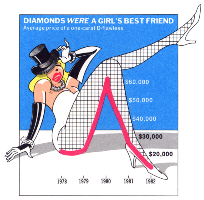
Figure 5.3 shows a pie chart of video analysis by medical professionals. Only three values are shown, yet there is a flourish of colors, cartoons, clipart, and embellishment.

Tufte was pretty crufty about anything that was not minimalist. He is an pro-modernist design and anti-baroque design. And there is some research that suggests more ornamented and interesting visualizations stick with people longer than minimal designs.
5.2 Data-Ink Ratios
The second Tufte-ism is the ratio of data-ink. This is a quantitative measure indicating the amount of ‘ink’ used to convey data/information in a visualization. Any ‘ink’ not conveying information is considered superfluous and redundant.

A simple example from the tidyverse would be to compare the default theme for a ggplot() with theme_bw() or theme_minimal().
Here’s Figure 4-2 with the default theme. Notice all that background ‘ink’ in gray.
Tufte would definitely prefer Figure 45-5 where we removed all that background and even the frame around the outside of the map.
This is an aesthetic preference, especially in the modern era where almost all of the visualization we engage with is on a computer/tablet/phone. There is no amount of pixel-ink that is consumed. And in some cases the brightness of a white background may be antithetical and harmful, such as in the ProPublica Sacrifice Zone visualizations as shown in Figure 17.2.
5.3 What makes a map in leaflet bad?
Most of the teams are using leaflet maps. What things in leaflet look bad and don’t work?
Discuss
5.4 Class Exercise - work on group visualization
Here’s a framework for the final group visualization from the Junk Charts Blog
- What is the practical question?
- What does the data you have say about the question?
- What do the individual visualizations say?
I would add:
- Who is the audience for the visualization?